
Summary
The Harvest app sought to solve users’ challenges with the Farmers Market experience, particularly surrounding ease of access to seasonally-relevant information. This project showcases each step of the ten week process, giving insight into our my learning and growth in tackling each phase of the user-centered design process.
This project culminated in the interactive prototype shown on the right, featuring high fidelity mockups of our final product.
Process
For a comprehensive look at the project as a whole, visit the harvest website. For a look at my process and role on this team, read on.
Research Stages
Semi-structured Interviews
Walk-a-Mile Immersion
Personas
User Journey Map
Design Question
Design Stages
Storyboards
Information Architecture
Interface Design
Paper Prototyping
Wireframes
Final Mockups
Research Stages
Semi-Structured Interviews
In the beginning stages of this project, we had chosen Farmers Markets as our design community but wanted to learn more about the challenges, goals, and experiences of two particular user groups: vendors and customers. Our team conducted 8 semi-structured interviews: 3 vendor interviews, 4 shopper interviews, and a phone interview with the executive director of the Neighborhood Farmers Market Alliance. Over the course of a week, we visited various farmers markets to recruit and interview vendors and shoppers in their environment. For my research I interviewed vendors, and synthesized insights with the rest of my team when we regrouped.

Walk-a-Mile Immersion at the market

Farm fresh produce at the Ballard Farmers Market
Key Insights from Vendor Interviews
Seattle’s turbulent weather patterns are often vendors’ largest obstacle to successful sales
Vendors rely heavily on word of mouth to attract people to the Farmer’s Market.
Vendors feel that having a more intimate platform to sell their products allows them to form more meaningful connections with customers than if they only sold their products in a store.
Narrowing Our User Group
After this initial research, we decided to focus our project on designing solutions for Farmers Market Shoppers. Many of the vendors were satisfied with their overall market experience and each had their own distinct challenges. However in interviewing shoppers, distinct pain point patterns emerged, highlighting problems we felt were both widespread and solvable.
Our group’s decision to focus on a user group that I hadn’t personally conducted research with was my first challenge. The ability to rely and build on my teammates’ work became crucial to contributing meaningfully to our project, and is a skill I’ve now employed in many projects beyond Harvest.
These decisions led us to create two personas and a user journey map to encapsulate our research findings and allow them to better guide design decisions.
Personas
From our interviews, the two most prominent categories of farmers market shoppers tended to be tourist shoppers and regular customers, each represented by a personas shown below. After deliberation, our team decided to design specifically for the regular shopper, whose values, goals, desires and pains are encapsulated in the Farmers Market Frequenter persona.
Click to enlarge
Click to enlarge
User Journey Map
After choosing to focus on the Farmers Market Frequenter, we created a journey map detailing significant moments in their journey. While I did contribute to the journey map through input on visual design and collaborating to determine the graphic scale, this deliverable was where I began to find my role as the primary content strategist on our team.
Click to enlarge
Design Question
After synthesizing insights from each of these research stages, we identified our final design question. Shown below, this question breaks “shopper confusion” down into three key challenges we saw shoppers repeatedly encounter. This question and its components guided our design strategy moving forward, and directed our problem solving efforts towards specific, solvable pain points.

Design Stages
Storyboards
Moving into the design phase of this project, we used storyboards to generate ideas on how to solve the challenges defined by our design question. Each member of the team was given a specific problem to solve for, and we generated two storyboards each — one sketched, one digital — to illustrate ways we might solve these problems.
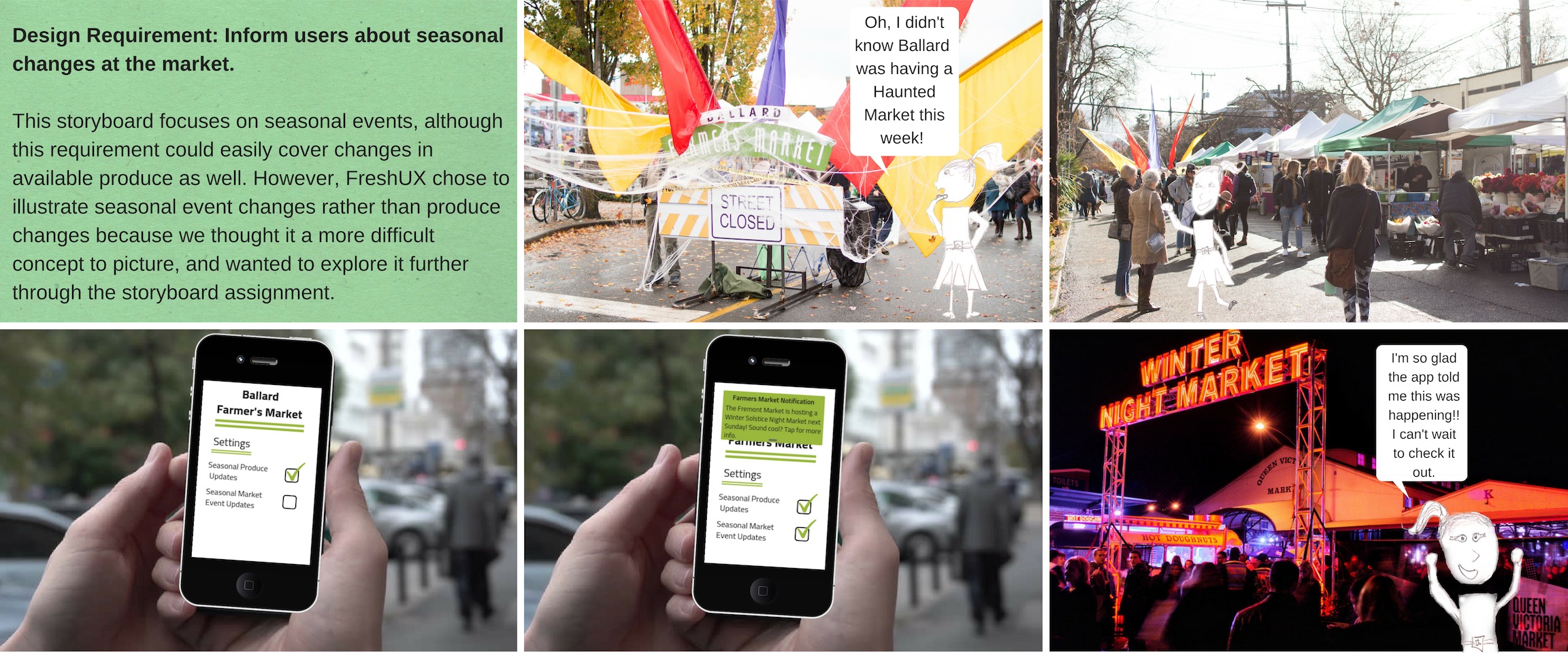
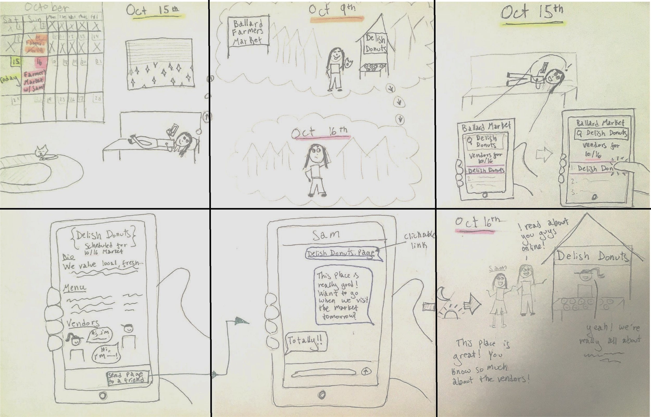
After comparing storyboards, we decided that a smartphone app was best suited to solve the problems we’d identified. An app’s ability to be accessed on the go, as well as user research suggesting our audience would be willing to use an app were the driving factors behind this decision.
Information Architecture
As a team, we decided which features would be most important to include and created an information architecture diagram. This exercise allowed us to more explicitly see the screens and interactions we would be creating, as well as better understand our application’s overall structure.
Click to Enlarge
Interface Design
Each team member developed their own version of what the screens could look like, then through group discussion we determined the features from each set of sketches we wanted to carry over to our final design. Following are my original interface design sketches.
In discussion on this round of interface design, we agreed to include several key elements:
A navigation bar at the bottom with tabs for Home, Grocery List, Vendors, and Profile
A dropdown menu at the top of the app that allowed the user to switch markets
The ability to search for / filter by both products and vendors in the search bar
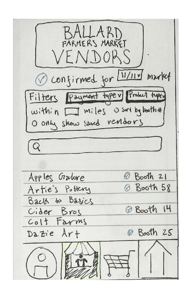
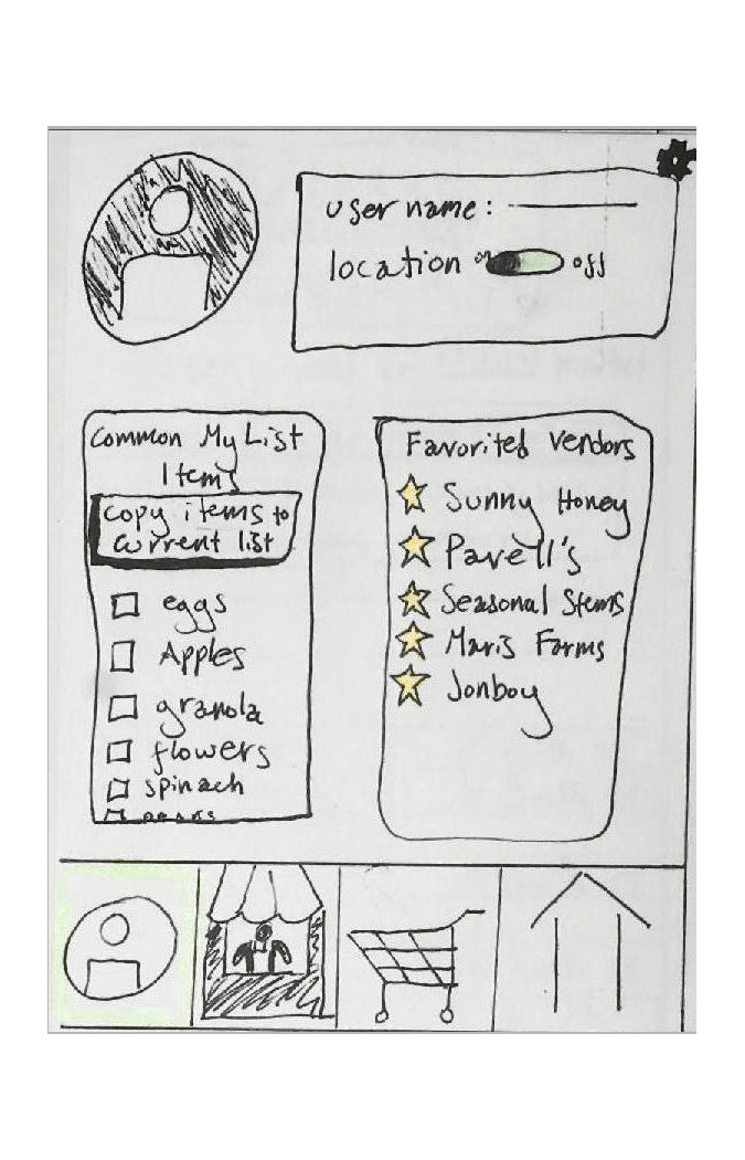
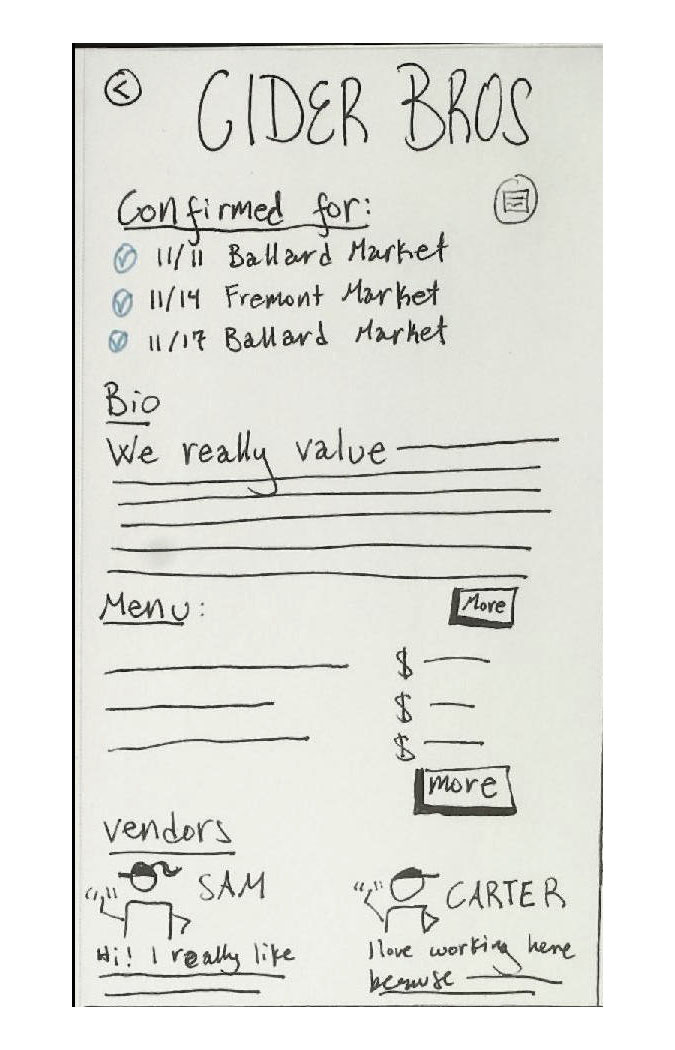
Paper Prototyping
To test our early-stage interface designs, we created a paper prototype and took it to the Ballard Farmers Market to solicit direct user feedback. This step allowed us to test hypotheses on what interface designs users understand and prefer. We tested volunteers’ ability to complete three key tasks:
Checking to see if a particular vendor would be at the market that week and if they would, finding that vendor’s accepted payment types
Adding “eggs” to their grocery list and determining which vendors would be carrying eggs that week.
Switching from the Ballard Farmers Market view to the University District Market view and saving the new market to their “Saved Markets” list.
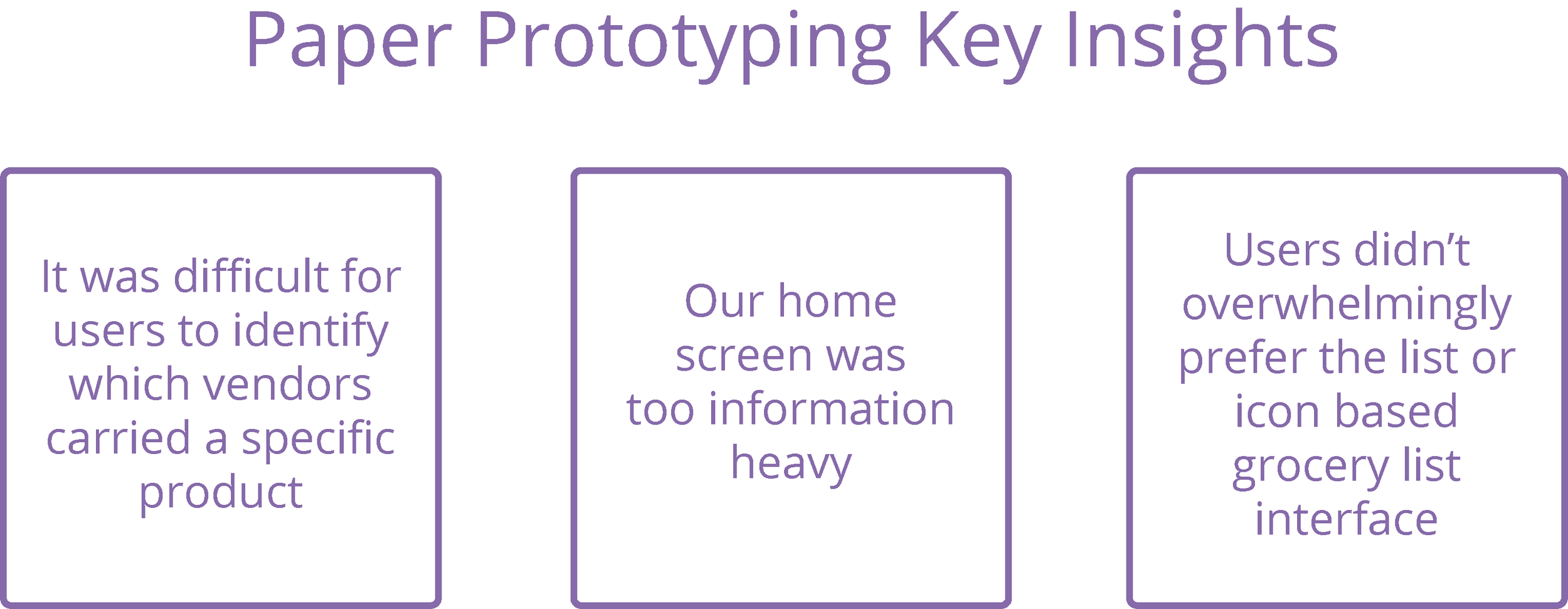
In response to these insights, we modified our design before creating wireframes. The next round of interfaces included simplification of several features in response to this research.
User difficulty with identifying which vendors carried a different product led us to eliminate the ‘profile’ tab int he navigation bar, replacing it with a ‘products’ tab. This decision prioritized usability of the app over retaining consumers’ information. The usefulness of a profile for this type of app was limited as data can be stored locally on the device, allowing us to clear up a major pain point for our users.
Descriptions of the home screen as cluttered and at times overwhelming led us to prioritize features core to the product and eliminate others. For example, originally we had included a 'featured events’ section on our home screen, but this feedback led us to remove it for the sake of emphasizing interface elements more central to the app’s fundamental purpose.
In testing both the list and icon based interfaces for the grocery list feature, users didn’t show an overwhelming preference for either one. Our tests were evenly split between users who preferred the icon and list views, but those who preferred the icon view still recognized the value of the list view. With this information, we decided to include a toggle feature that could display the rocery list in either format. This toggle feature gave slight priority to the list view by landing a first-time user on that interface design and allowing them to naturally discover the icon based view.
Wireframes
Insights from our users tests were incorporated into wireframes of each app screen. With these wireframes, we were able to clearly map out Key Path scenarios our users could take through the app, and scrutinize possible pain points in the usability of our interfaces when working through these crucial process flows. An example key path scenario is shown below.
Final Mockups
As our team discussed the emotions we wanted to evoke through our visual design, we decided on a friendly, playful aesthetic in line with the atmosphere of the farmers’ market. In particular, we wanted to evoke these feelings while still maintaining a sense of cleanliness and usability, features we felt were sometimes lost in overly playful interface designs. To achieve these goals, we honed in on certain features we planned to carry throughout our visual language.
Visual Language Elements
flat logo iconography
rounded, sans-serif title and header fonts
rounded corners on interface elements
bright colors
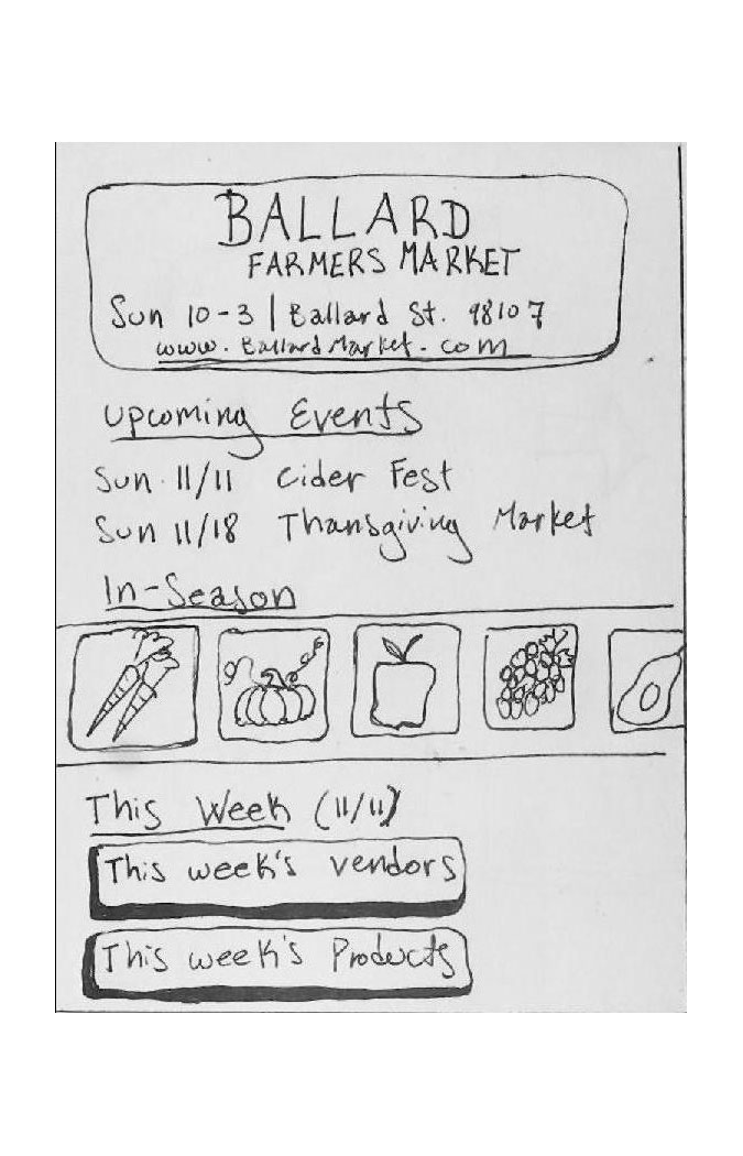
Our most prominent decision in creating our final screen mockups stemmed from a desire to visually enforce the understanding of Farmers Markets as seasonally reliant entities. After ideating through several representations of this characteristic, we settled on an interface background that changes according to season. This quirk was intended to draw our users’ attention to the changing of the seasons and bring notice to the parallel changes this cycle produces in the Farmers Market experience.
Click to Enlarge
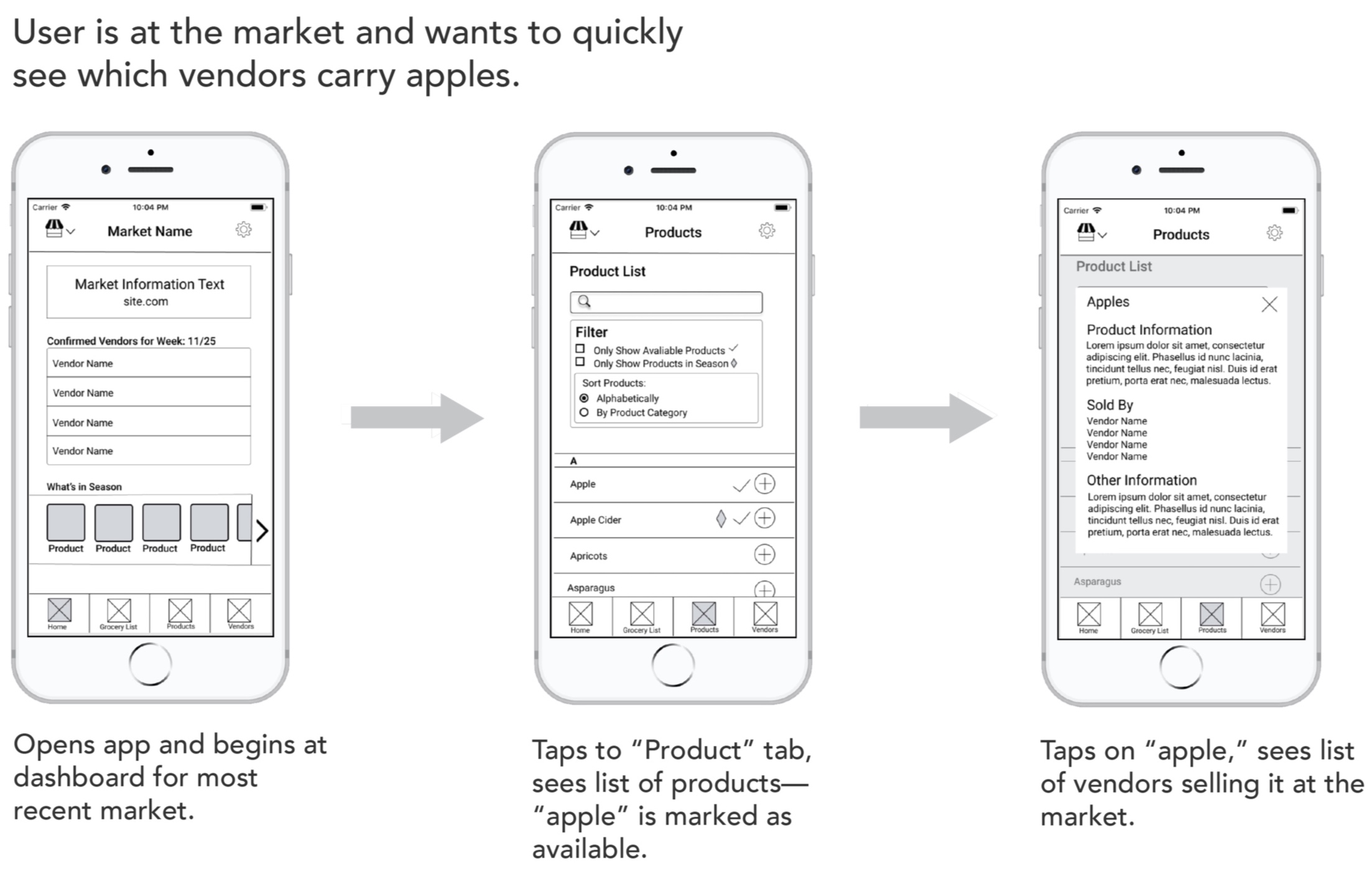
Finding Product Information
Our top priority in creating final mockups was tackling a key cause of shopper confusion, lack of up to date information about product details and availability. To make information about seasonally changing products more accessible, we included a “what’s in season” horizontal scroll bar on our home page. Towards this aim, we also included a “product” tab on the navigation bar showing information about products and their availability at the market.
Click to Enlarge
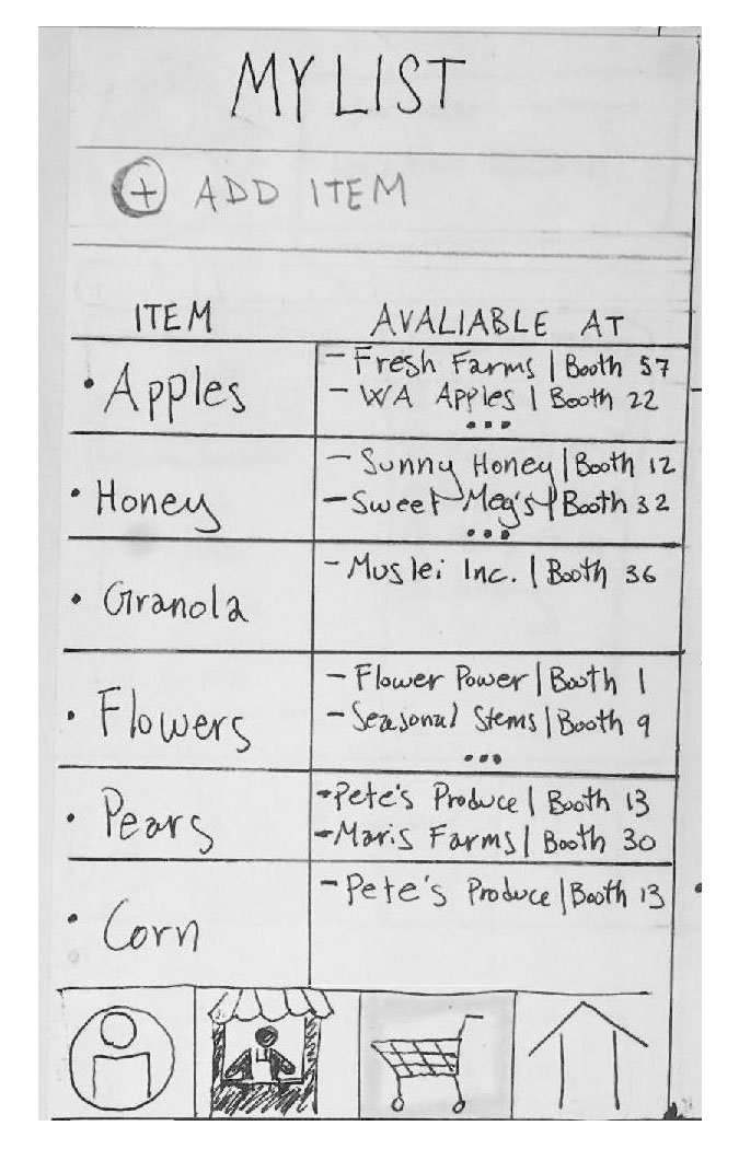
The Grocery List tab allows users to save and easily re-access products they buy on a regular basis, as well as check whether those products will be available that coming week. Our paper prototyping showed promising results for both a “list view” and “basket view” interface design, so we included both with the option to toggle between.
Click to Enlarge
Finding Vendor Information
Another key source of shopper confusion was difficulty finding up to date information about vendors and their availability. In response to this, we listed confirmed vendors for the current market on the home screen, and included a vendors tab with detailed information about each vendor at the market.
Click to Enlarge
Exploring Multiple Markets
To address our third key source of shopper confusion, inability to find information about multiple markets on one platform, we included a global drop down menu allowing users to switch between and save multiple markets.
Click to Enlarge
